Design for the limbic brain. Or be forgotten.
There is a moment, very early in any encounter, that most brand strategists never talk about. A person lands on your website, sees your logo in a feed, or receives your email. Before they read a headline or evaluate a claim, their brain may already be registering whether this feels safe or threatening.
Safe or unsafe. Familiar or foreign. Worth my attention or not.
This is not metaphor. This is neuroscience. And it is the foundation of everything we call neuro-branding.
We are entering a new era of brand strategy. One that does not begin with logos or taglines, but with the architecture of the human brain. An era where the most powerful brands are not the loudest, but the ones that feel safest to pay attention to. This is the Neuro-Branding Era. If you are encountering this thinking for the first time, Learn the Forge offers a grounding in the neuroscience framework behind it.
What Is Neuro-Branding?
Neuro-branding is the intentional design of brand experiences, visual, verbal, behavioural, and sensory, that align with how the human brain actually processes trust, memory, and meaning.
It is not a trend. It is not neuroscience borrowed to dress up marketing language. It is the recognition that every brand touchpoint is a neurological event. And that the brain was always the real audience.
Every color, every word choice, every content rhythm sends an emotional signal before the rational mind has finished weighing anything. People often respond to feeling first. They do not read your positioning statement. They do not care about your USPs. They feel your brand before they think about it.
Neuro-branding asks a different set of questions:
- Not "Is our messaging clear?" but "Does our messaging feel calm and safe?"
- Not "Is our content engaging?" but "Is it being remembered?"
- Not "Are we consistent?" but "Are we predictable enough to feel safe?"
Neuroscience Note: Research in affective neuroscience, including work by Joseph LeDoux and Antonio Damasio, shows that emotion is integral to how people evaluate and decide, and LeDoux's animal research identified a fast route by which sensory signals can reach the amygdala without first passing through the cortex. Brands that trigger low-level threat responses through urgency, cognitive overload, or inconsistency face an uphill battle that no clever headline can solve.
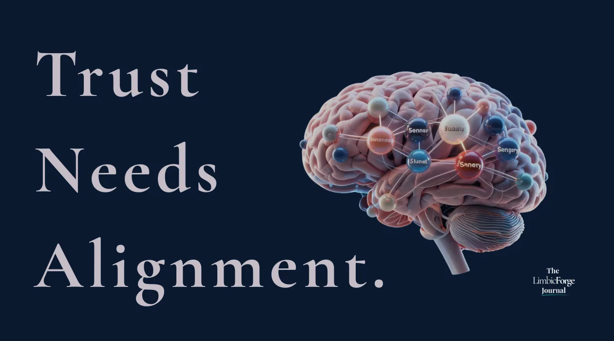
Limbic Shortcuts: Safety, Familiarity, Congruence
Brand congruence is the ultimate safety signal, when visual and verbal elements align, the brand is easier to take in and builds more trust.
People make quick judgments based on pattern, repetition, and emotional signal, and they rely on shortcuts to save effort. For brands, this means three things matter above everything else.
Safety. People notice threat quickly. Brands that feel calm, predictable, and non-coercive make it easier to engage and to trust.
Familiarity. The brain's mere exposure effect means repeated, consistent signals build affinity over time. Familiarity is not boring. It is the neurological foundation of brand loyalty.
Congruence. When visual, verbal, and behavioural signals align, the brand is easier to process. Coherence tends to reduce effort and support recall. Incoherence does the opposite.
Most brand failures are not messaging failures. They are congruence failures. The visual says "premium." The copy says "urgent, limited, act now." The customer experience says "we do not know who we are." People experience these contradictions as a warning sign, and quietly walk away.
"Most brand failures are not messaging failures. They are congruence failures. And people sense them before they can name them."
This is why a founder can spend six figures on a rebrand and still feel invisible. The problem was never aesthetic. It was neurological alignment.
Visuals, Language, and Rituals That Encode Memory
If the limbic brain votes first, then every brand asset is a limbic signal. Here are the three primary encoding channels.
Visuals
Color is one of the first things people notice about a brand, and it carries emotional associations.
We use deep blue to signal calm and authority, teal for belonging and safety, and amber for warmth.
Visual consistency across touchpoints creates recognition. When someone sees your brand color in their peripheral vision and feels at ease, that is recognition at work. That is not just branding. That is memory design.
Language
Words are not just semantic units. They shape how a message feels. Language that creates urgency, fear of missing out, or social pressure can feel stressful. The audience may comply in the short term, but trust erodes. You cannot stress someone into loyalty.
In contrast, language that is calm, clear, and inviting can feel safe, which supports trust. Phrases that acknowledge the reader's agency and that offer instead of demand help build the foundation of long-term brand relationships.
Compare:
"Last chance, do not miss this opportunity."
versus
"When you are ready, here is a path worth exploring."
Same intent. Completely different neurological experience.
Rituals
Behavioural rituals are perhaps the most underrated memory encoding tool available to brands. The predictable patterns in how a brand shows up. The recognisable rhythm of how it speaks. When a brand publishes consistently, greets its audience in a familiar rhythm, uses signature phrases, or creates recognisable structures in its content, the brain begins to anticipate and relax into it.
This is predictable cadence as a trust mechanism. Consistency lowers the threat response. Rhythm builds safety. Safety opens the door to memory. Memory creates loyalty that no amount of paid advertising can replicate.
The Stress-Test: Icon to Billboard
One practical framework for evaluating limbic trust in brand design is the Icon-to-Billboard stress test. It asks a simple but revealing question.
If you stripped your brand to its smallest recognisable unit, an icon, a word, a color, would it still communicate the core emotional signal? And if you scaled it to the largest possible format, a billboard, a conference stage, a national campaign, would it hold the same feeling?
Think of the brand whose favicon you recognise before the tab fully loads. Or the one whose color stops you in a crowded feed before you register the logo. That is not luck. That is recognition built through deliberate, repeated design.
Brands that pass share something in common. Their visual identities are not decorative. They are distinctive. They have trained the brain to recognise them through repetition, simplicity, and emotional consistency.
Brands that fail often reveal deeper problems: too many visual elements competing for attention, messaging that varies by channel, a brand identity built around aesthetics rather than emotional architecture. The icon-to-billboard test surfaces these misalignments before they cost six figures to fix.
The Playbook: Designing for Recall
Neuro-branding is not a philosophy to admire from a distance. It is a practice. Here is where to begin.
Audit your congruence, not just your consistency. Consistency is showing up regularly. Congruence is showing up with the same emotional signal across every touchpoint, visual, verbal, behavioural, and experiential. Run a cross-channel audit to identify which emotion each touchpoint triggers. Are they all pointing to the same core feeling?
Design a safety signal, not just a value proposition. Your safety signal is the immediate, pre-conscious impression your brand creates. It lives in your color temperature, your typographic rhythm, the pace of your copy, and the tone of your first email. Ask: does my brand feel safe to pay attention to before a single conscious decision is made?
Build recognition anchors deliberately. Choose two or three repeating brand cues, a signature phrase, a visual motif, a content format, and repeat them with intention across every platform. Memory is not built by variety. Memory is built by repetition of distinctive signals.
Audit your language for pressure. Read every piece of marketing copy through this lens: does this phrase pressure the reader or invite them? Replace urgency language with invitation language. Replace fear-based calls to action with agency-based ones.
Establish a communication rhythm and protect it. Decide how often your brand speaks, in what format, with what predictable structure, and maintain it. Rhythm is the neuroscience of trust made practical.
Pass the three-question consent test before anything ships (the Consent Filter™ applies this framework interactively):
- Does this invite attention or take it without permission?
- Does it regulate or trigger the nervous system?
- Will it be remembered with trust?
If any answer is no, pause, redesign, or reject.
A Final Word: The Era Has Begun
We are not entering an age where brands will be won by louder advertising budgets, sharper copy, or viral campaigns alone. We are entering an age where the most durable brands will be the ones that understand a quiet but profound truth.
Attention is not a metric. It is gravity. And gravity is earned through safety, through rhythm, through the slow and patient work of building a presence your audience's nervous system can relax into.
The Neuro-Branding Era is not a disruption. It is a return to the kind of branding that has always worked at the deepest level. The kind that forges memory instead of chasing clicks. The kind that earns trust instead of extracting it. The kind built not on pressure, but on the steady, living flame of consent.
Design for the limbic brain. Or be forgotten.
This article sits alongside Trust Forms in Three Layers, which maps the specific neurological stages through which brand trust develops. When you are ready to apply this diagnostic to your own brand, the Neural Clarity Sprint™ is the structured engagement that maps your brand's nervous system.
Published by The LimbicForge Journal.
Take the next step
If this resonates, the Brand Nervous System Audit™ is a free 7-minute diagnostic that will show you exactly where your brand sits on the consent spectrum.
Begin the Audit